First impressions happen in milliseconds. When potential clients see your business online, your visual presentation instantly tells them if you are a modern industry leader or a business left behind.
If your visual assets look tired, you create an invisible roadblock to sales. Buyers often assume that an outdated look means your product or service is equally out of date.
An outdated logo hurts trust and sales long before anyone reads your message. Fixing issues like 3D gradients, unreadable mobile logos, old fonts, and messy templates helps you regain authority and win more clients.
What Is Visual Brand Identity and Why Does It Matter Now?
Let's start with basic definitions:
- Brand Identity: The collection of visible elements—like your logo, fonts, color choices, and image styles—that represent your business.
- Logo: The main symbol or mark used to identify your company.
Understanding the importance of branding comes down to clear communication. Today, your logo must look clean on mobile screens, app icons, and dark-mode displays.
If your visual assets look amateurish, potential buyers lose confidence. Updating your look builds instant credibility and keeps your company competitive.
Here is what we will cover in this guide:
- The 5 clear signs your visual identity is outdated.
- Simple, step-by-step ways to fix each issue.
- How to choose between a minor refresh and a total rebrand.
Let's start with signs…
Extreme Skeuomorphism & Overloaded Gradients
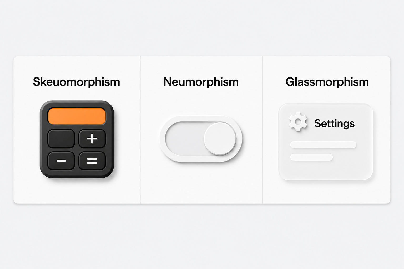
What It Looks Like:
Back in the late 2000s, popular designs used glossy badges, 3D drop shadows, metallic textures, and multi-color gradients.
If your logo still relies on 3D effects or heavy shadows to look realistic, it immediately dates your company. Modern design uses clean shapes, simple lines, and flat colors.
Why It Hurts Your Business
3D textures and heavy shadows turn into a blurry mess on small mobile screens. This makes your logo hard to recognize on social media profiles or browser tabs.
How to Fix It
Remove extra drop shadows, glows, and fake textures. Redesign your mark using simple vector shapes. Make sure it stays clear whether it is on a large sign or a tiny mobile screen.
Non-Responsive Assets and Mobile Unfriendliness
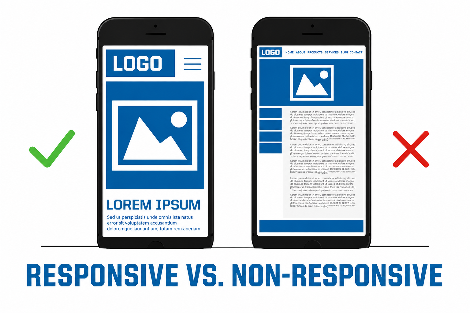
What It Looks Like
Years ago, logos were designed mostly for desktop sites, paper brochures, and storefront signs. Today, most people interact with brands on mobile phones.
If your logo is a long horizontal image with tiny taglines or detailed drawings, it will not fit well on a phone screen.
Why It Hurts Your Business
A logo that becomes unreadable on a phone looks unpolished. When people cannot read your name, brand recognition drops.
How to Fix It
Improve your digital brand strategy by creating a flexible logo system:
- Primary Logo: Full version for desktop site headers and large signs.
- Stacked Variant: Compact version for cards and smaller areas.
- Brand Mark / Monogram: Simple icon built for social media profile pictures and mobile app icons.
Typography Trapped in a Previous Era
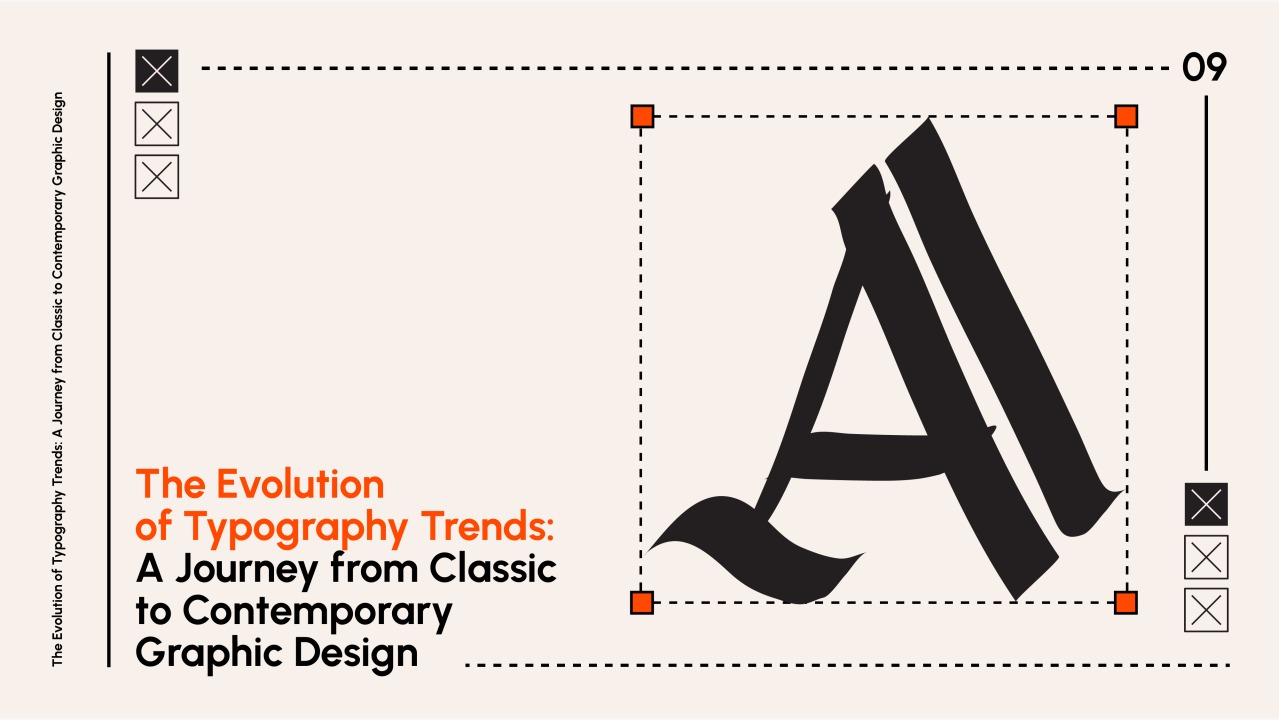
What It Looks Like
Font styles change over time. Using trendy fonts from ten years ago, like overly decorative scripts or distressed grunge styles, makes your business look old-fashioned.
Poor spacing and mismatched font choices also make your design look cheap.
Why It Hurts Your Business
Fonts share your tone before anyone reads your text. Dated or messy fonts signal a lack of effort and reduce the perceived value of your offer.
How to Fix It
Update your font choices. Switch to clean, easy-to-read font families like modern sans-serifs or clear serifs. Set clear rules for heading and body text sizes across all platforms.
Cliché Cluttered Imagery & Overused Visual Metaphors
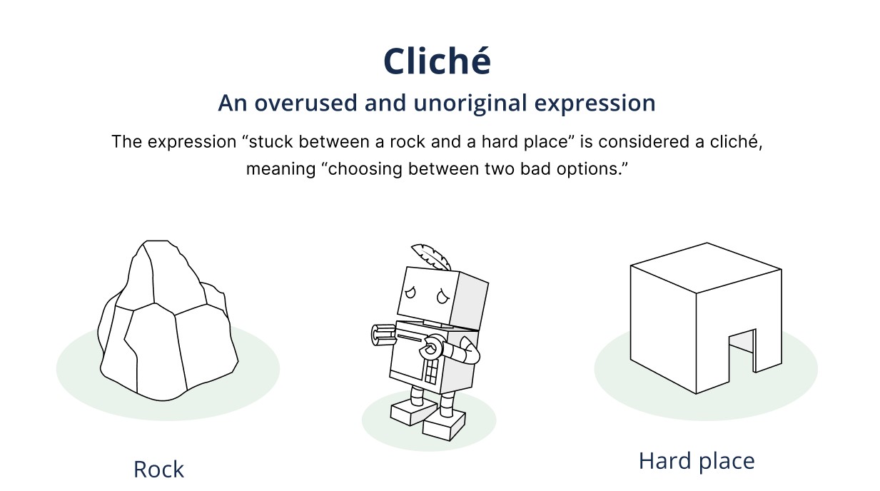
What It Looks Like
Many industries fall into the same visual traps:
- Tech Firms: A globe wrapped in swooshing lines.
- HR Companies: Abstract people holding hands in a circle.
- Consulting Firms: A lightbulb combined with gears.
When thousands of companies use these exact ideas, the symbols lose their impact.
Why It Hurts Your Business
Common symbols make you blend in with everyone else. When you look like every competitor, customers end up choosing based on price instead of value.
How to Fix It
Move away from literal pictures of what you do. Focus on unique lettermarks or simple abstract shapes that reflect your speed, quality, or main values. Top brands rarely put a literal picture of their product in their logo.
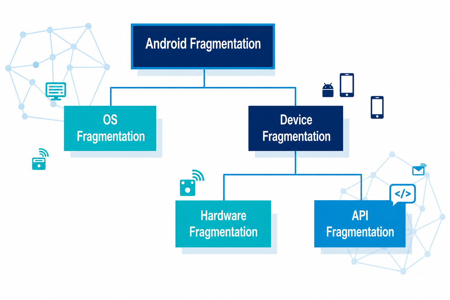
Visual Fragmentation Across Touchpoints
What It Looks Like
As a business grows, different people create new materials over time. Without clear rules, your visuals break apart:
- Your website uses modern fonts and bright colors.
- Your sales decks use old logo files and default fonts.
- Your social media images use random stock templates.
Why It Hurts Your Business
A lack of brand consistency confuses potential clients. Mismatched materials make your company appear disorganized and careless. Furthermore, failing to maintain a consistent presentation across all channels leaves money on the table. Studies show that consistent brand presentation can increase overall revenue by up to 23%, while 60% of buyers actively avoid brands that look visually out of date.
How to Fix It
Create a single brand style guide. List your exact color codes, font pairings, and logo rules. Provide standard templates so every employee uses the exact same files.
Strategic Refresh vs. Full Rebrand
| Strategy | When to Choose | Core Action Items |
|---|---|---|
| Brand Refresh | Your business model is stable, but your visuals look dated, inconsistent, or bad on mobile screens. | Clean up fonts, simplify colors, fix logo shapes, and set clear style rules. |
| Full Rebrand | Your core services, target market, business name, or company direction have completely changed. | Go through a full rebranding process to pick a new name, positioning, and complete visual look. |
Step-by-Step Guide to Modernizing Your Visual Assets
Collect All Marketing Files
Gather your sales decks, website pages, social graphics, and print flyers in one place.
Test Mobile Sizes
Check how your logo looks at small icon sizes on a phone screen.
Check Colors and Fonts
Remove dated fonts and ensure your text colors are easy to read against backgrounds.
Create Logo Options
Build a primary logo, a stacked layout, and a simple icon version.
Share Style Guidelines
Give your team central templates to keep your brand consistency strong going forward.
Aligning Appearance with Value
Your visual identity should make it easy for clients to trust you. Modernizing your logo and assets protects your authority and helps convert more readers into customers. It is about aligning your external presence with the actual quality, innovation, and value your platform delivers today.
Ready to Modernize Your Digital Brand?
If your current software, web experience, or visual system is holding back your growth, GStar can help. We engineer modern design systems, custom applications, and scalable growth engines that position your business as an undeniable market leader.